 |
 |
 |
 |
 |
 |
 |
 |
 |
 |
 |
 |
 |
 |
 |
 |
 |
 |
 |
 |
 |
 |
 |
 |
 |
 |
 |
 |
 |
 |
 |
 |
 |
 |
 |
 |
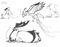
This is the current state of my portfolio. I'd love to hear anything anyone has to say about it.
You can see higher res pictures of famine here:
http://davidsdailysketchblog.blogspot.com/2012/10/day-71-famine.html
You can expect to see more of the "A Masked People Project" on this blog soon.

Dude, lots of solid work here. I'm no expert on visual development, but I think overall you have a wide range of subject matter while keeping with a consistent style. My main issue is with presentation. Even though you have titles for everything and different sections, it still seemed haphazardly put together when I looked at it. You character sheets could be composed a little better and perhaps consider some sort of consistent backdrop for every project.Same with the type, looks like it wasn't given much thought. Overall though, love your work, as always!
ReplyDeleteLoved Winter so much I bought a copy at CTN!
ReplyDeleteJesse
Justacarguy.blogspot.com